Richard D. James has a thing for faces. Specifically, his own. If you’ve ever browsed a record store or scrolled through a digital library and felt a pair of mischievous, distorted eyes drilling into your soul, you’ve encountered the bizarre world of Aphex Twin album covers. It’s not just marketing. It’s a deliberate, decades-long project in digital uncanny valley territory.
Most artists want to look cool. Or mysterious. Richard? He wants to look like a nightmare that just told a joke only he understands.
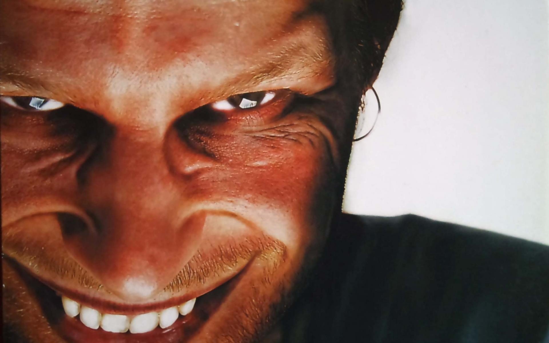
The Grin That Defined an Era
You can't talk about Aphex Twin without mentioning the "Richard D. James Album." Released in 1996, it features a tight crop of his face. But it’s wrong. The forehead is slightly too expansive. The smile is too wide, bordering on the predatory. It’s a masterclass in psychological discomfort.
Why do this?
Back in the nineties, electronic music was often faceless. Producers hid behind gear or stayed in the shadows of the DJ booth. By slapping his mangled visage on every surface, James flipped the script. He became the "face" of IDM (Intelligent Dance Music), a term he famously loathes. The cover was created by Paul Nicholson, the same guy who designed the iconic "A" logo. Nicholson has often discussed how the logo itself was hand-drawn on graph paper, intended to look like an alien sigil or a stylized compass.
It’s iconic. It’s also deeply weird.
But the obsession with the face reached its peak—or perhaps its valley—with the "Windowlicker" EP. That cover is genuinely unsettling. It features a high-glamour bikini model body topped with Richard’s bearded, grinning head. It’s a jarring juxtaposition that mocks the hyper-sexualized nature of the music industry. It wasn't just a laugh; it was a critique of how videos and covers were used to sell records in the late nineties.
Moving Away from the Human Form
Sometimes the Aphex Twin album covers go the opposite direction. They get cold. Clinical.
Take "Selected Ambient Works 85-92." It’s just the logo. That's it. A simple, sharp-edged "A" on a textured, off-white background. It looks like a corporate logo from a dystopian future. Honestly, it’s one of the most effective pieces of branding in music history. You see that curve and you immediately hear the lush, analog synths of "Xtal."
Then you have "Drukqs."
The packaging for the original vinyl and CD releases was elaborate. It looked like the keys of a prepared piano. It was abrasive and mechanical, matching the frantic, drill-n-bass energy of the music inside. It didn't need a face because the music sounded like a machine breaking apart in a beautiful way.
Then there's "Syro."
Released in 2014 after a massive hiatus, the artwork for "Syro" is basically a receipt. Designed by The Designers Republic (the same studio behind the "Wipeout" games), it lists every single cost associated with the album’s production. It lists the gear used. It lists the promotional expenses. It’s the ultimate expression of transparency, turning the mundane logistics of the music business into a piece of minimalist art.
It’s genius because it’s so boring it becomes fascinating.
The Digital Artifacts of the Uncanny Valley
A lot of people think these covers are just Photoshop filters. They aren't. They involve a deep collaboration with visual artists like Chris Cunningham and Dan Boyle.
In the "Come to Daddy" era, the visuals moved into video, where "Aphex-headed" children ran through concrete estates. This wasn't just about being "edgy." It was about the distortion of identity. When you look at these Aphex Twin album covers, you’re seeing the birth of "glitch" as an aesthetic.
The intentional errors.
The warped proportions.
The "wrongness."
It mirrors the music perfectly. Just as James takes a simple drum loop and mangles it until it’s unrecognizable but still rhythmic, his collaborators take the human form and stretch it until it’s alien but still human.
Why the "A" Logo Matters More Than You Think
The logo is the anchor.
Whether it's hidden on a sandpaper-textured sleeve or plastered on a billboard in London, that "A" is a seal of quality. It tells the listener that whatever is inside is going to be uncompromising. Paul Nicholson, the creator, has shared his original sketches online, showing the mathematical precision that went into those curves. It’s based on a "lambda" symbol, but it’s been warped into something unique.
Interestingly, fans have spotted the logo in the most random places. In the "Windowlicker" track, if you run the audio through a spectrogram, a distorted image of Richard’s face actually appears in the frequencies.
Think about that. The "cover" is literally embedded in the sound.
The Impact on Modern Aesthetics
You see the influence of these covers everywhere today. In the distorted filters of TikTok, in the glitch-art of vaporwave, and in the "ugly-cool" aesthetic of high-fashion brands like Balenciaga. James and his team saw where the digital world was going before we even had high-speed internet.
They realized that in a world of perfect digital replication, the most interesting thing you can do is break the image.
The Aphex Twin album covers work because they reject the "cool." They embrace the grotesque. They force you to look, even if you want to look away. That’s the definition of successful art.
How to Collect and Value the Physical Art
If you’re looking to get into the world of Aphex Twin through the physical releases, there are a few things to keep in mind regarding the artwork:
- Check the Texture: Original pressings of "Selected Ambient Works Volume II" often have specific textures on the sleeve that are lost in modern digital thumbnails.
- The "Syro" Insert: If you buy the vinyl, the "receipt" artwork unfolds into a massive list of technical data. It’s a very different experience than just seeing the cover on a phone screen.
- Limited Editions: Warp Records often releases limited versions with alternative colorways or die-cut sleeves. The "Cheetah" EP, for example, mimics the aesthetic of vintage synth manuals.
Actionable Insights for Fans and Collectors
To truly appreciate the visual legacy of Richard D. James, don't just look at the low-res versions on streaming services.
First, track down the high-resolution scans of the "Syro" liner notes. They provide a literal map of the synthesizers and sequencers used, which is a goldmine for music tech nerds. Second, look into the work of Paul Nicholson (Number 3) on social media; he frequently posts the original process drawings for the logo and various tour merch.
Finally, watch the "Windowlicker" and "Come to Daddy" videos in the highest quality available. The album art is a snapshot, but the videos are the art in motion. Seeing how the "Richard face" moves and reacts explains the covers better than any essay ever could. It’s about the fluidity of the digital self.
Collecting these records isn't just about the music. It's about owning a piece of a visual revolution that started in a bedroom in Cornwall and ended up changing how we look at the human face in the digital age.